A Plot's X Axis: Time, Samples, or Custom
Every plot needs an X axis. When to plot against time, against sample number, or against another dataset as an XY plot, and why a custom X axis matters.

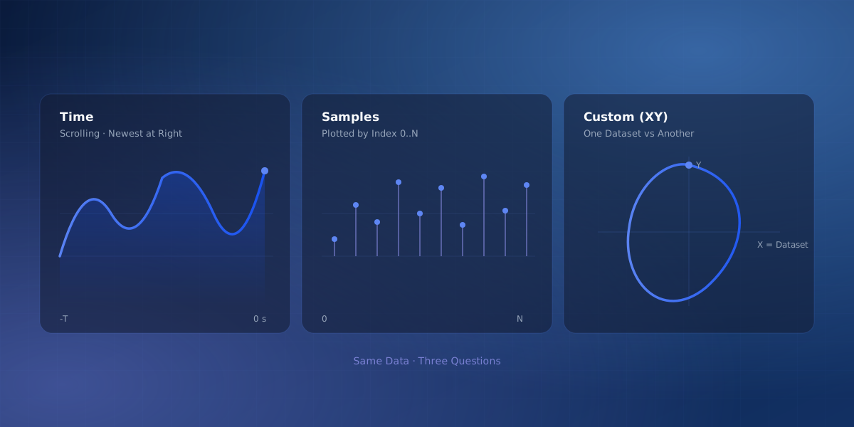
When you put a signal on a chart you are really plotting two things: the value on the Y axis, and whatever you are measuring it against on the X axis. Most tools quietly assume the X axis is time and never ask. That default is usually right, but not always, and the cases where it is wrong are exactly the ones that produce a "my graph looks weird" moment. Serial Studio lets a plot use one of three kinds of X axis, and picking the right one clears up a surprising amount of confusion.
Time: the scrolling default
By default, a plotted dataset uses a time axis. The chart scrolls, showing the most recent window of data. That window runs from minus T seconds up to now, with the newest reading pinned at the right edge, and you set T with the Time Range field. This is what you want almost all the time: watch a temperature drift, see a control loop settle, catch a spike as it happens. The time axis is available in the free version.
But notice what "time" means here. It is the host's clock, the moment each sample arrived at Serial Studio. That is perfectly fine when samples arrive at a steady rate. It can mislead you when they do not, and that is where the other two options come in.
Samples: when the index is what matters
Set the X axis to Samples and the chart plots against sample number instead: 0, 1, 2, up to N, newest at the right. The width of the view is the Point Count (how many samples the plot keeps) rather than a number of seconds.
Reach for this when the sample index is the meaningful axis and wall-clock time is not:
- Your device sends data in bursts, so arrival time is lumpy. On a time axis the points bunch up where a burst landed and leave gaps in between. Against sample number, every reading gets even spacing.
- You are comparing fixed-length captures (say repeated 512-point runs) and want them aligned by index.
- You do not have timestamps at all, and the order of the samples is the only thing that matters.
The Samples axis is available in the free version.
Custom: plot one value against another
The third option is the interesting one. A custom X axis points the plot's X source at another dataset, so instead of value-versus-time you get value-versus-value. This is the XY (or scatter) plot. The custom X axis is available in the Pro version.
XY plots answer a different kind of question:
- Phase plots. Plot two axes of motion against each other, or a signal against a delayed copy of itself, to see the shape of the dynamics: a Lissajous figure, a limit cycle.
- I-V curves. Plot current against voltage to characterize a diode, a solar cell, or a transistor.
- Trajectories. Plot Y position against X position to draw the actual path a robot or a pen took, instead of watching each coordinate scroll past on its own.
In every one of these, time is not what belongs on the bottom of the chart. Another measured quantity is.
The case that makes it click: real timestamps
Here is a concrete reason the custom X axis exists, taken from a real question. Suppose your device batches high-rate data: each frame carries several accelerometer samples, and every sample has its own timestamp measured on the device. Plot those samples against the host's arrival time and they all land at nearly the same instant, because the whole batch arrived at once, so the real timing inside the batch is lost. Against sample number you see the order but not the actual intervals.
The fix is to treat the device's timestamp as data. Map timestamp as its own dataset, then set it as the plot's X-axis source. Now each sample is drawn at the exact device time it was recorded, not the moment its frame reached the host.
Here is the same batch of eight accelerometer samples, plotted the two ways described above. By sample number the points fall into a neat, evenly spaced row, nothing hints at how they actually arrived. By device timestamp the same values tell the real story: four samples close together, a gap of roughly 300 ms, then four more.
xychart-beta
    title "8 accelerometer samples - by sample number"
    x-axis [1, 2, 3, 4, 5, 6, 7, 8]
    y-axis "Acceleration X (g)" -1 --> 2
    line [0.98, 1.02, 0.95, 1.1, -0.2, -0.15, -0.22, -0.18]
xychart-beta
    title "Same 8 samples - by device timestamp (custom X axis)"
    x-axis ["0.00s", "0.01s", "0.02s", "0.03s", "0.31s", "0.32s", "0.33s", "0.34s"]
    y-axis "Acceleration X (g)" -1 --> 2
    line [0.98, 1.02, 0.95, 1.1, -0.2, -0.15, -0.22, -0.18]
The values on the two charts are identical. Only the X-axis labels change, and that change is the whole point: the timestamp axis shows the batch gap that the sample-number axis hides.
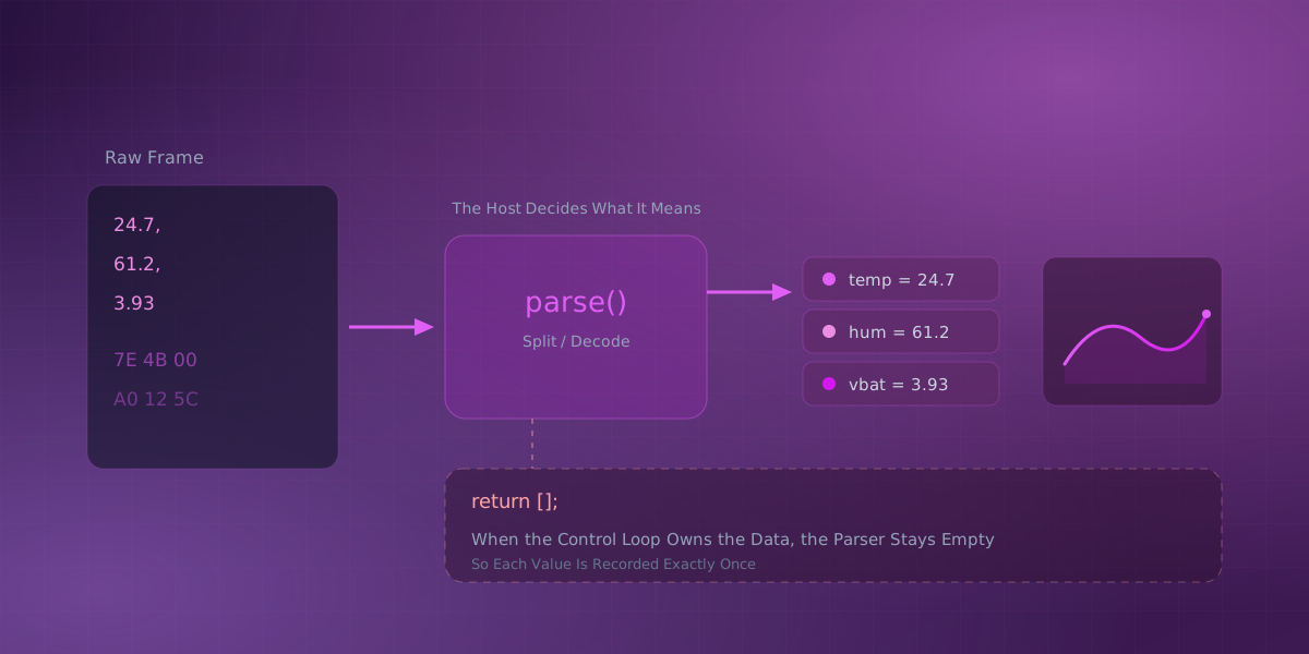
What makes this work is that the frame parser can return an array of rows. Each row is one complete sample, and each row becomes one point on the chart, so a single frame can deliver a whole batch of precisely-timed points:
// one frame carries a batch of samples; return one row per sample
function parse(frame) {
  const batch = JSON.parse(frame).samples;   // [{ t, ax, ay, az }, ...]
  return batch.map(s => [s.t, s.ax, s.ay, s.az]);
}
Map the first column to a timestamp dataset and set it as the X-axis source for each acceleration dataset, and the batch plots on a true device-time axis rather than on frame-arrival time. A custom X axis is a per-Plot setting (one signal against the X dataset), so ax, ay, and az each become their own Plot; a MultiPlot's shared axis stays limited to Time or Samples.
Which one to pick
| Mode | What the X axis shows | When to use it | Tier |
|---|---|---|---|
| Time | The host's clock, newest at the right | Watching a live signal; it is the default for a reason | Free |
| Samples | Sample number, 0 to N | Bursty arrival, fixed-length captures, or no timestamps | Free |
| Custom | Another dataset's value | Value against value, or samples that carry their own timestamps | Pro |
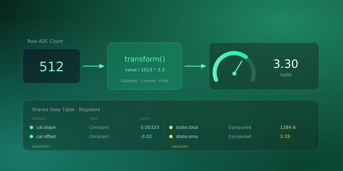
The Plots reference covers the axis settings and the oscilloscope-style Sweep and Trigger mode in full. If the parser side is new to you, How Serial Studio Turns Bytes Into Datasets explains where parsing belongs, Calibrate Sensor Data covers what happens to each parsed value on its way to the chart, and the frame parser reference covers returning multiple rows.
Comments